Hero
A pre-defined band featuring a headline, call to action, and prominent imagery.
  {% include "@bolt-components-hero/hero.twig" with {
  content: "Hero content goes here",
  background: "/images/heros/hero-background--yellow.svg",
  image: "/images/heros/hero-foreground--yellow.png",
  theme: "dark",
} only %}
| Prop Name | Description | Type | Default Value | Option(s) |
|---|---|---|---|---|
|
content
|
The content to display in the Hero |
string
, array
, object
|
— |
|
|
theme
|
Color theme to use within the Hero. |
string
|
none
|
|
|
background
|
The path to a background image that displays underneath the content / foreground image in the Hero. |
string
| — |
|
|
custom_background
|
Renderable background image for this item, should use the Image or Shape component. |
string
, object
, array
|
— |
|
|
image
|
The path to a foreground image that displays along-side the other Hero content. |
string
| — |
|
|
image_srcset
|
A valid image srcset value with different cuts of the image for different breakpoints |
string
| — |
|
|
imageAlign
|
Adjusts the Hero Image's horizontal alignment |
string
|
center
|
|
|
imageValign
|
Adjusts the Hero Image's vertical alignment |
string
|
middle
|
|
|
imageMinWidth
|
Customizes the min width of the Hero Image |
string
|
none
|
|
|
imageMaxWidth
|
Customizes the maximum width of the Hero Image |
string
|
450px
|
|
|
reverseOrder
|
Reverses the order on larger screens (desktop) so the image comes first (left column) and the content comes second (right column). |
boolean
|
false
|
|
|
attributes
|
A Drupal attributes object. Applies extra HTML attributes to the parent element. |
object
| — |
|
npm install @bolt/components-hero
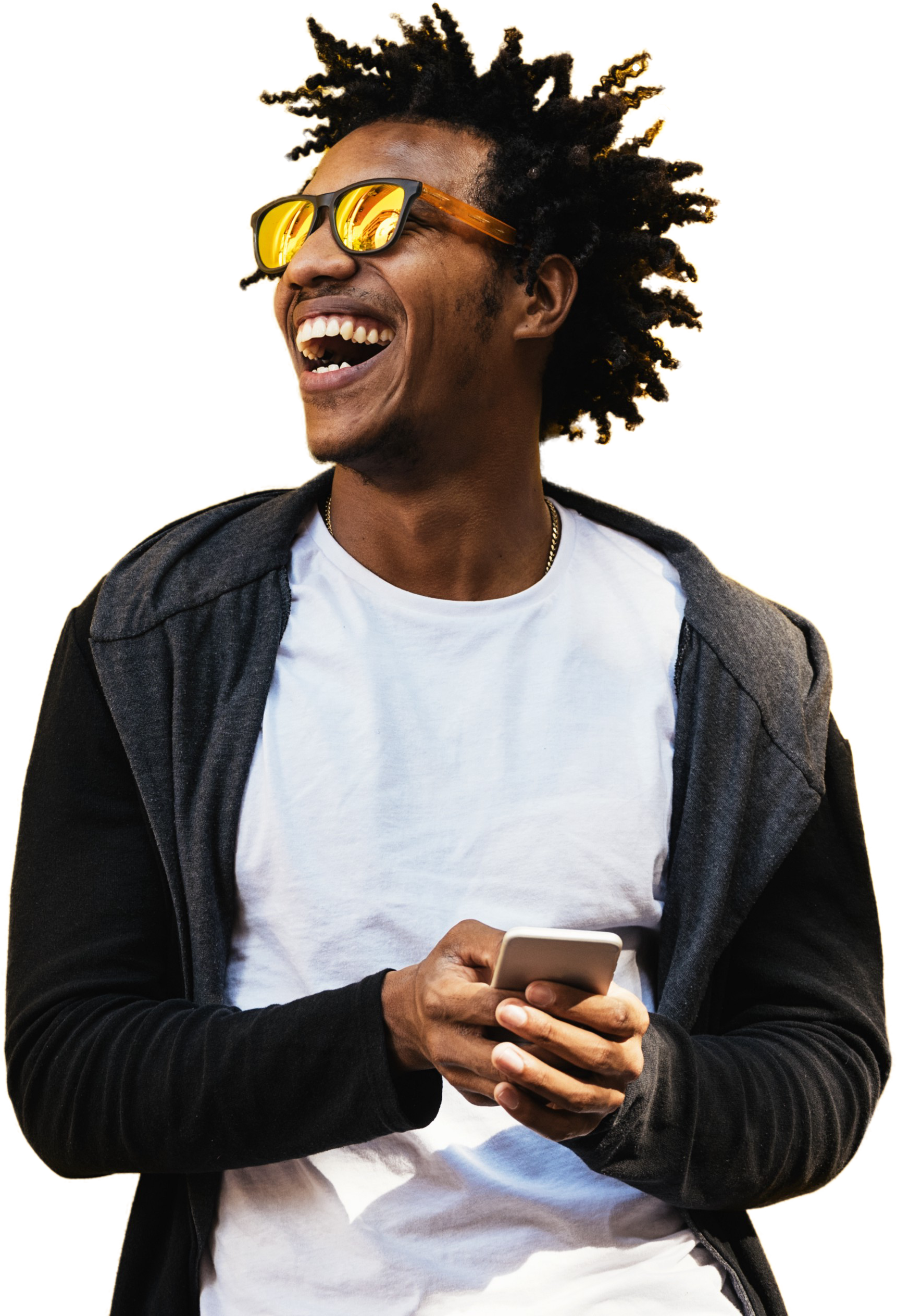
contentimage pathimageValign prop)theme color (light)Hero Title
reverseOrder prop to reverse the Hero's default column order so that on larger screens, the Image shows up on the left and the Content shows up on the right.

Boston Convention & Exhibition Center May 31 - June 2, 2020
reverseOrder prop still swaps the column order of Image / Content on larger screens, even if a Hero doesn't contain an image!
While Heros don't require an image...
Perhaps a Band would be a better fit for these types of use-cases?
< type="button" href="../../patterns/40-components-band/index.html" class="e-bolt-button e-bolt-button--secondary" >Band Component DocsimageMinWidth prop to "pin" the image to the right side of the screen on larger devices.
A Prominent Headline Certainly Helps
This one even includes a tagline.
imageAlign prop so the image is right-aligned within it's Grid column instead of being center (default) or left aligned. This horizonal alignment is especially visible on smaller screens or when using smaller-width images.
It's show time.
Please join us for PegaWorld 2019 event at MGM Grand in Las Vegas
Monday, June 3rd, 2019
10AM - 3PM EST

imageValign prop to top so the image is always flush with the top-edge of the Hero container.


Boston Convention & Exhibition Center May 31 - June 2, 2020
imageValign prop to bottom so the image is always flush with the bottom-edge of the Hero container.Note: this automatically adjusts the content order on smaller (mobile) screens so the Image displays after the main content instead of before.

Pega is one of the key technologies that we are using to rebuild our application landscape.

custom_background prop. This allows you to customize any of the available Image component props, such as align or valign.Note: If using the custom_background prop, you must set cover to true for the custom image to display properly in the background. For more information, check out the Image component.
valign prop to top.
valign prop to bottom.